Product Design/ UIUX Project
Product Design/ UIUX Project
Product Design/ UIUX Project
Stockfeel Official Website Redesign
Stockfeel Official Website Redesign
Stockfeel Official Website Redesign
Translating business services into a clear external narrative
Translating business services into a clear external narrative
Translating business services into a clear external narrative
— Stockfeel
— Stockfeel
— Stockfeel
Project Overview
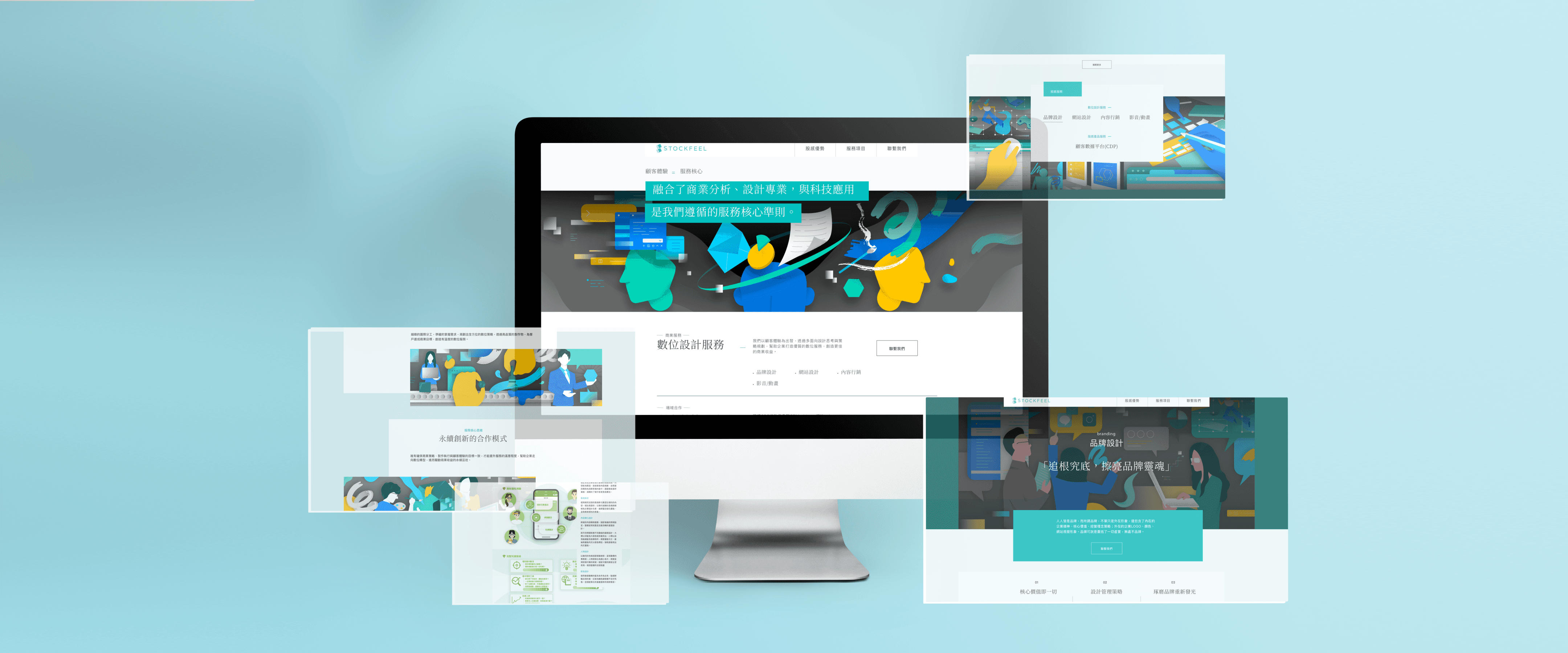
Stockfeel’s website is the main external entry point for partners and clients. I designed it to clearly explain what we do, show proof through case studies, and stay flexible as services evolve—supporting sales, marketing, and recruiting with one consistent narrative.
Official Website | Personal Contribution
1
Built the site’s information architecture and page hierarchy around real sales/recruiting questions
2
Turned internal service offerings into clear, client-facing copy and story blocks
3
Defined reusable templates (service / case study) to reduce future design overhead
4
Aligned content ambition with operational reality so teams could keep the site updated

Official Website | Personal Contribution
1
Built the site’s information architecture and page hierarchy around real sales/recruiting questions
2
Turned internal service offerings into clear, client-facing copy and story blocks
3
Defined reusable templates (service / case study) to reduce future design overhead
4
Aligned content ambition with operational reality so teams could keep the site updated
Introduction
At a Glance
The Problem
Stockfeel didn’t have a clear place to explain its services externally. Most clients learned about us through product usage or referrals, which made partnerships hard to scale. We needed a site that could tell a coherent story across different services—and still be easy to expand later.
Competitor Research
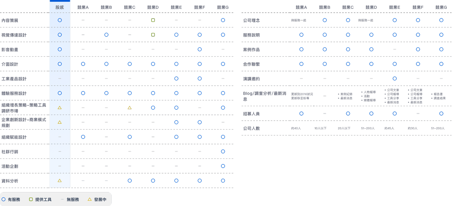
I reviewed competitor sites through two lenses: how they position services, and how they structure content. The gap was clear—many sites list capabilities, but few explain them with credible proof. That pushed us toward “service narrative + case study evidence” as the core structure.
Competitor Research(Traditional Chinese Ver.)
Wireframe & Content Structure
Structure shapes understanding. I mapped key content blocks (services, cases, credibility signals) and checked what each one would cost to maintain. The final layout keeps high-trust content visible, while using templates so internal teams can publish updates without redesigning pages each time.
Key Design Decisions
Lead with “What we do” + proof
Put service positioning first, then back it with case studies and outcomes.
Case-study templates for scalability
Standardize structure (context → solution → impact) so teams can publish consistently.
Clear pathways by intent
Separate flows for “Partner with us,” “See case studies,” and “Join the team,” so visitors don’t have to hunt.
Credibility through restraint
Use strong imagery and a structured grid; keep motion subtle so the brand feels stable and trustworthy.
UI Style & Visual Direction
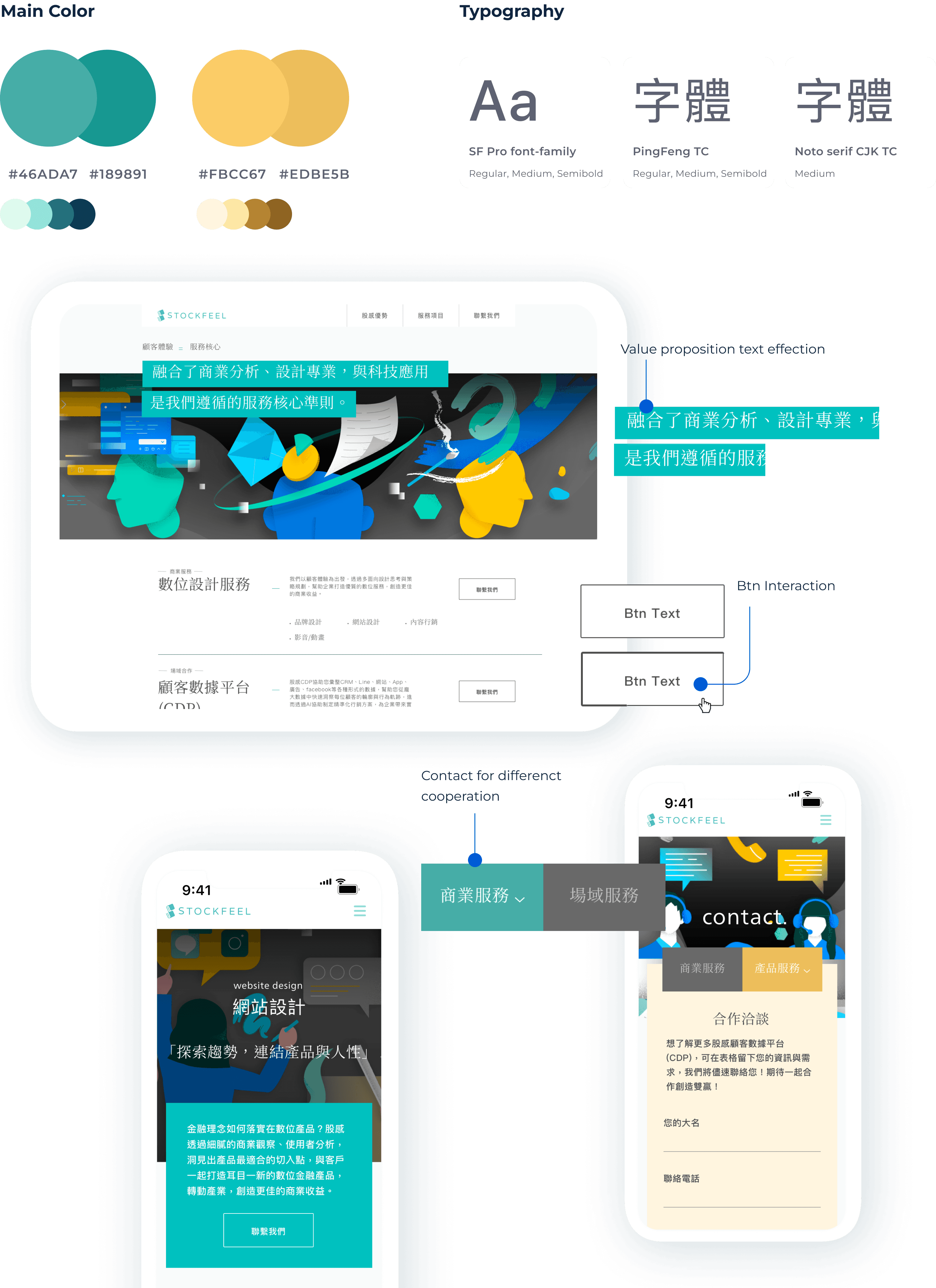
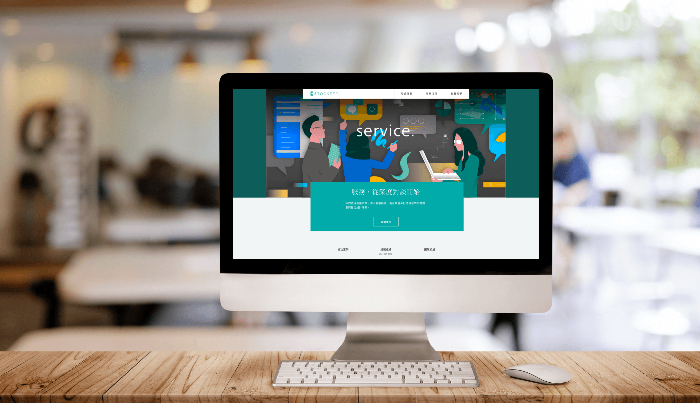
We aimed for a balance: professional enough to build trust, but not sterile. Early concepts leaned expressive, but feedback favored stability and clarity. The final direction uses large imagery, restrained motion, and a structured layout to signal a mature, reliable brand.
Graphic Style Definition
Professional
7
3
Creative
Combine the elements of the two styles on the interface
Professional
Create a professional, rigorous, and imposing feeling
visual elements
Large and real image
Sharp and color shape
Contrast layout
Creative
Give a lively, self-styled feeling
visual elements
More bold interaction on the interface
Stylish illustration
Design Solution
Outcome
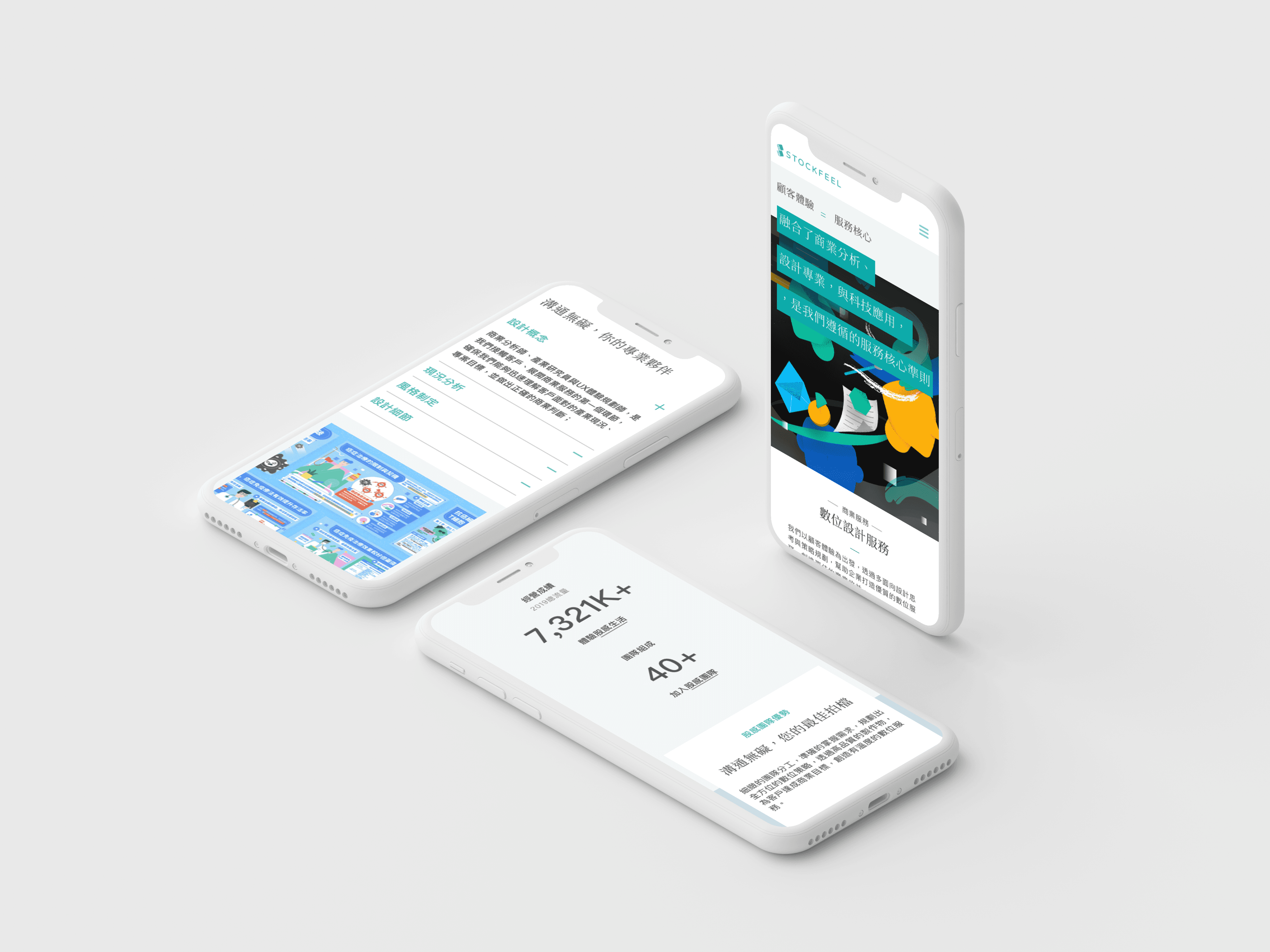
The site became a long-term platform for business development, recruiting, and brand communication. More importantly, it shipped with reusable templates and simple guidelines—so different teams can keep publishing updates with minimal design support.
Introduction
At a Glance
The Problem
Stockfeel didn’t have a clear place to explain its services externally. Most clients learned about us through product usage or referrals, which made partnerships hard to scale. We needed a site that could tell a coherent story across different services—and still be easy to expand later.
Competitor Research
I reviewed competitor sites through two lenses: how they position services, and how they structure content. The gap was clear—many sites list capabilities, but few explain them with credible proof. That pushed us toward “service narrative + case study evidence” as the core structure.
Competitor Research(Traditional Chinese Ver.)
Wireframe & Content Structure
Structure shapes understanding. I mapped key content blocks (services, cases, credibility signals) and checked what each one would cost to maintain. The final layout keeps high-trust content visible, while using templates so internal teams can publish updates without redesigning pages each time.
Key Design Decisions
Lead with “What we do” + proof
Put service positioning first, then back it with case studies and outcomes.
Case-study templates for scalability
Standardize structure (context → solution → impact) so teams can publish consistently.
Clear pathways by intent
Separate flows for “Partner with us,” “See case studies,” and “Join the team,” so visitors don’t have to hunt.
Credibility through restraint
Use strong imagery and a structured grid; keep motion subtle so the brand feels stable and trustworthy.
UI Style & Visual Direction
We aimed for a balance: professional enough to build trust, but not sterile. Early concepts leaned expressive, but feedback favored stability and clarity. The final direction uses large imagery, restrained motion, and a structured layout to signal a mature, reliable brand.
Graphic Style Definition
Professional
7
3
Creative
Combine the elements of the two styles on the interface
Professional
Create a professional, rigorous, and imposing feeling
visual elements
Large and real image
Sharp and color shape
Contrast layout
Creative
Give a lively, self-styled feeling
visual elements
More bold interaction on the interface
Stylish illustration
Design Solution
Outcome
The site became a long-term platform for business development, recruiting, and brand communication. More importantly, it shipped with reusable templates and simple guidelines—so different teams can keep publishing updates with minimal design support.