Product Design/ UIUX Project
Product Design/ UIUX Project
Product Design/ UIUX Project
Associative Search
Associative Search
Associative Search
Designing Search Results for Both Answer-Seeking and Knowledge Exploration
Designing Search Results for Both Answer-Seeking and Knowledge Exploration
Designing Search Results for Both Answer-Seeking and Knowledge Exploration
— Stockfeel
— Stockfeel
— Stockfeel
Project Overview
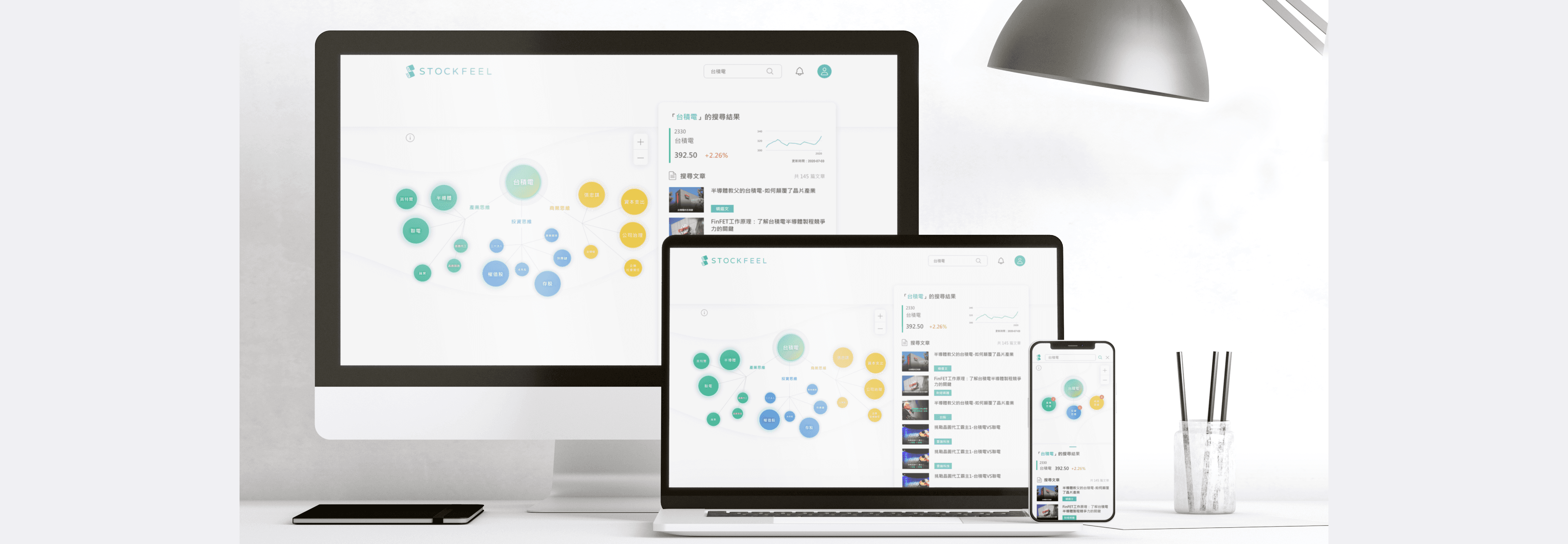
Associative Search is a feature designed to help users explore financial knowledge through relationships rather than isolated keywords.
Instead of a simple result list, search results are structured around relationships.Concepts are connected to related articles and financial products, so users can see why topics are related while searching.
Industry
IT
Year
2020-2021
Client
StockFeel
Role
Product Designer
Delivery
Website
Status
Archived
Associative Search |Personal Achievements
I led the end-to-end design of the associative search experience, aligning user needs, system logic, and business goals.
1
Led interaction and information architecture design for a highly data-driven feature
2
Collaborated closely with data scientists, editors, and engineers to define system logic
3
Designed interaction states and feedback to prevent user confusion
4
Iterated the product across multiple versions based on usage data and business goals

Associative Search |Personal Achievements
I led the end-to-end design of the associative search experience, aligning user needs, system logic, and business goals.
1
Led interaction and information architecture design for a highly data-driven feature
2
Collaborated closely with data scientists, editors, and engineers to define system logic
3
Designed interaction states and feedback to prevent user confusion
4
Iterated the product across multiple versions based on usage data and business goals
Introduction
At a Glance
The Problem
Users search with different intents: quick answers vs. exploratory learning.
Traditional search results struggle to support both without forcing a choice.
User Intent & Research
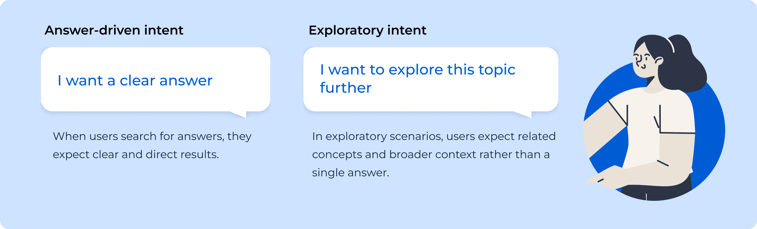
User search behavior generally falls into two modes: seeking a clear answer or exploring related concepts.
The challenge was supporting both intents in a single search experience—without forcing users to choose upfront or increasing cognitive load.
Primary user intent
Exploration triggered by the graph
View knowledge graph
Answer-oriented search
Search query
Exploration-oriented search
Select result
Answer-seeking mode
Skip graph
Search query
Interact with graph
Reach answer
View keyword-based results
View keyword-based results
Expand understanding
View knowledge graph

Stop interacting with the graph
Search Flow by User Intent
Beta Launch
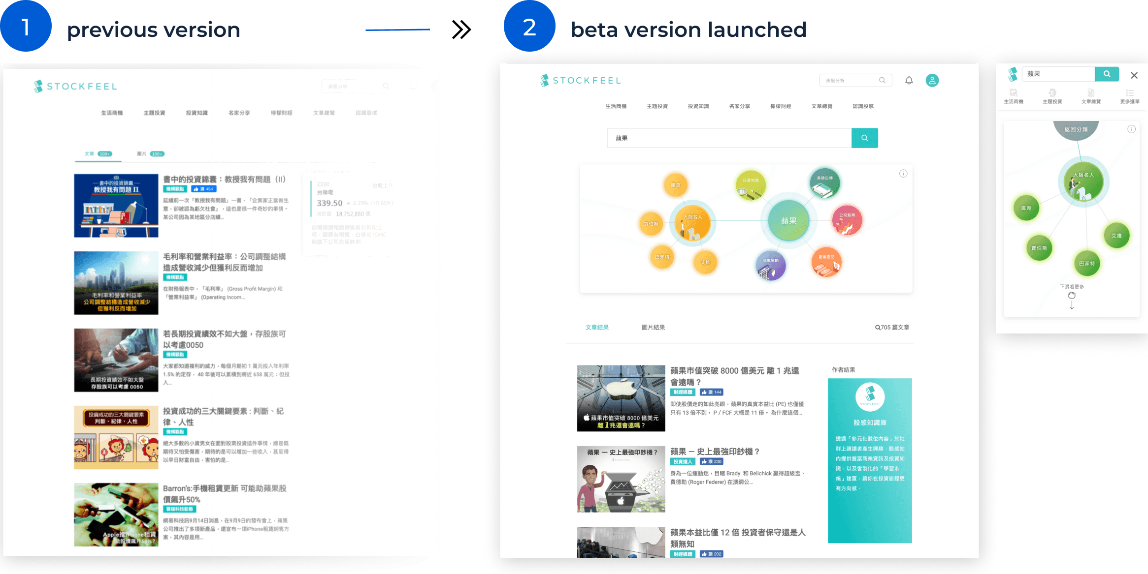
Associative Search was introduced as a beta feature alongside the existing keyword search.
This allowed the team to observe real usage patterns while minimizing disruption. Clear communication of the phased rollout helped align stakeholders and maintain a focused product direction.
Visual structure that preserves focus
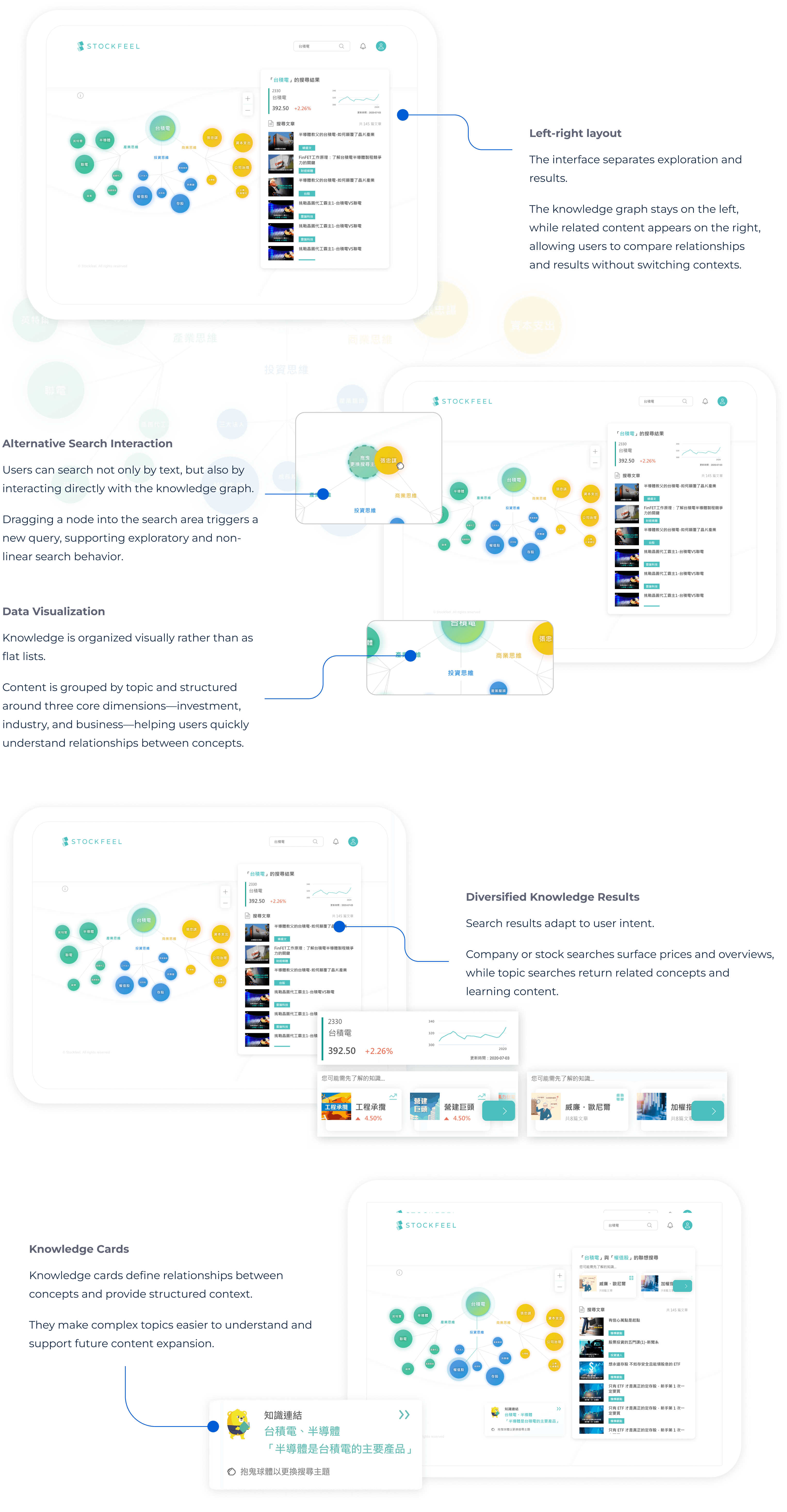
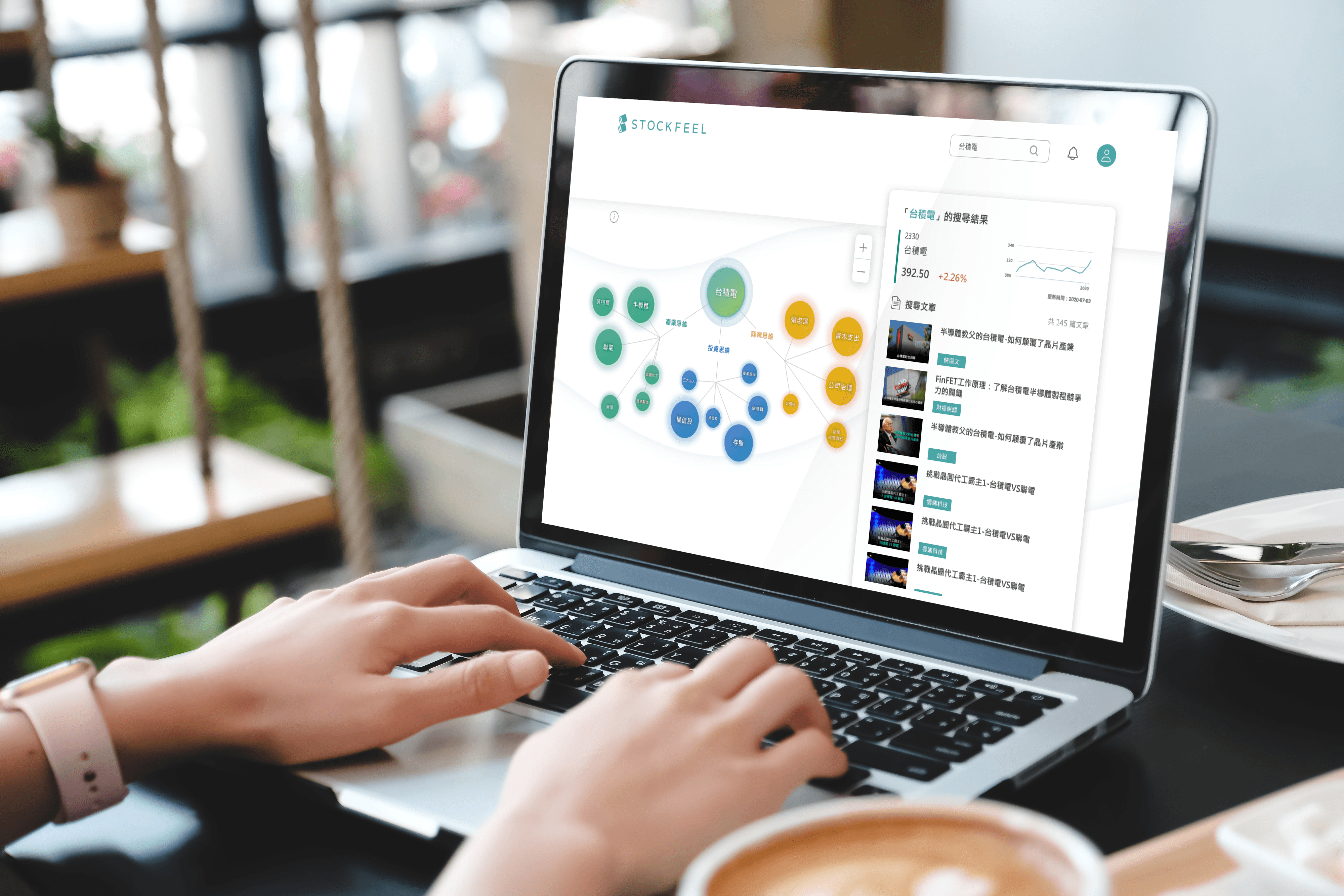
A left-right layout places the knowledge graph and result list side by side, allowing exploration to remain incremental and reversible, instead of disruptive.
This structure helps users build context while staying anchored to their original query.
Key Design Decisions
One search, two paths
A single search result supports both quick answers and open-ended exploration, based on how users interact rather than asking them to choose intent upfront.
Knowledge graph as an optional layer
The graph is visible but non-blocking. Users can ignore it when they want fast answers, or engage with it when curiosity emerges.
Side-by-side layout to stay oriented
Results and relationships are shown together, so users can explore without losing track of their original query.
Design Solution
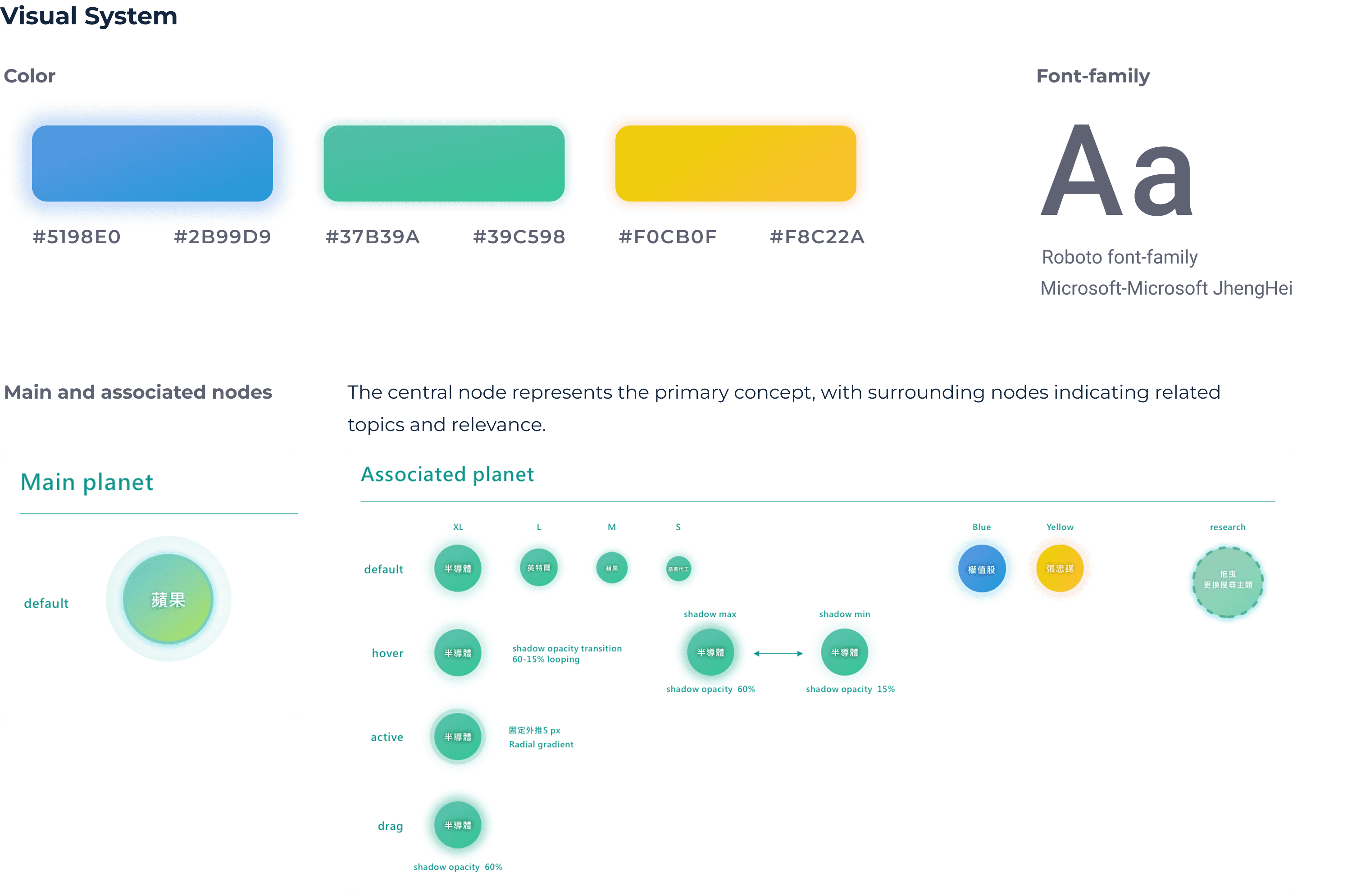
The core solution was a visual knowledge graph paired with structured result cards, allowing users to understand relationships quickly without breaking their search flow.
Cross-device Experience
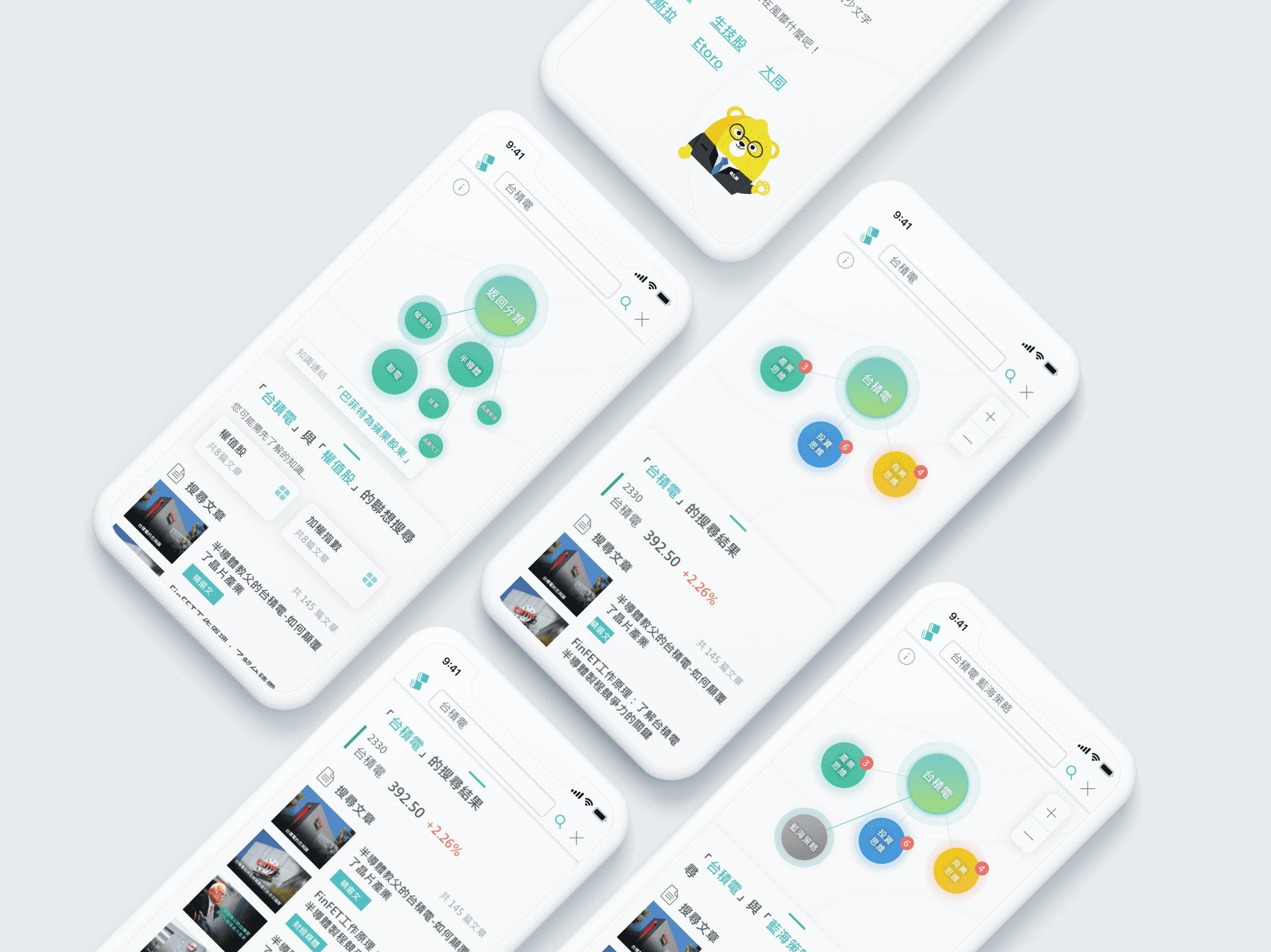
Maintaining a consistent experience across desktop, tablet, and mobile was a key challenge.
On smaller screens, the graph and results were separated into layered views. Users could expand the result panel to full screen when needed, allowing focused reading without losing context.
Outcome
The redesigned search results page:
Reduced friction for users seeking quick answers
Increased engagement for users exploring related knowledge
Allowed answer-seeking and exploration to coexist in a single flow, without adding extra steps or decisions.
By aligning interaction patterns with user intent, the search experience became more adaptive, efficient, and intuitive.
Reflection
This project reinforced that good search design is not only about accuracy, but about respecting how people think at different moments.
Introduction
At a Glance
The Problem
Users search with different intents: quick answers vs. exploratory learning.
Traditional search results struggle to support both without forcing a choice.
User Intent & Research
User search behavior generally falls into two modes: seeking a clear answer or exploring related concepts.
The challenge was supporting both intents in a single search experience—without forcing users to choose upfront or increasing cognitive load.
Primary user intent
Exploration triggered by the graph
View knowledge graph
Answer-oriented search
Search query
Exploration-oriented search
Select result
Answer-seeking mode
Skip graph
Search query
Interact with graph
Reach answer
View keyword-based results
View keyword-based results
Expand understanding
View knowledge graph
Stop interacting with the graph
Search Flow by User Intent
Beta Launch
Associative Search was introduced as a beta feature alongside the existing keyword search.
This allowed the team to observe real usage patterns while minimizing disruption. Clear communication of the phased rollout helped align stakeholders and maintain a focused product direction.
Visual structure that preserves focus
A left-right layout places the knowledge graph and result list side by side, allowing exploration to remain incremental and reversible, instead of disruptive.
This structure helps users build context while staying anchored to their original query.
Key Design Decisions
One search, two paths
A single search result supports both quick answers and open-ended exploration, based on how users interact rather than asking them to choose intent upfront.
Knowledge graph as an optional layer
The graph is visible but non-blocking. Users can ignore it when they want fast answers, or engage with it when curiosity emerges.
Side-by-side layout to stay oriented
Results and relationships are shown together, so users can explore without losing track of their original query.
Design Solution
The core solution was a visual knowledge graph paired with structured result cards, allowing users to understand relationships quickly without breaking their search flow.
Cross-device Experience
Maintaining a consistent experience across desktop, tablet, and mobile was a key challenge.
On smaller screens, the graph and results were separated into layered views. Users could expand the result panel to full screen when needed, allowing focused reading without losing context.
Outcome
The redesigned search results page:
Reduced friction for users seeking quick answers
Increased engagement for users exploring related knowledge
Allowed answer-seeking and exploration to coexist in a single flow, without adding extra steps or decisions.
By aligning interaction patterns with user intent, the search experience became more adaptive, efficient, and intuitive.
Reflection
This project reinforced that good search design is not only about accuracy, but about respecting how people think at different moments.